


Updated for 2025 · Based on 500+ Thumbnails Designed

YouTube Thumbnail Design
Best Practices

12 data-backed YouTube thumbnail design tips and guidelines used by channels with 3.6M+ subscribers. Real thumbnail design examples from our portfolio — not generic advice.

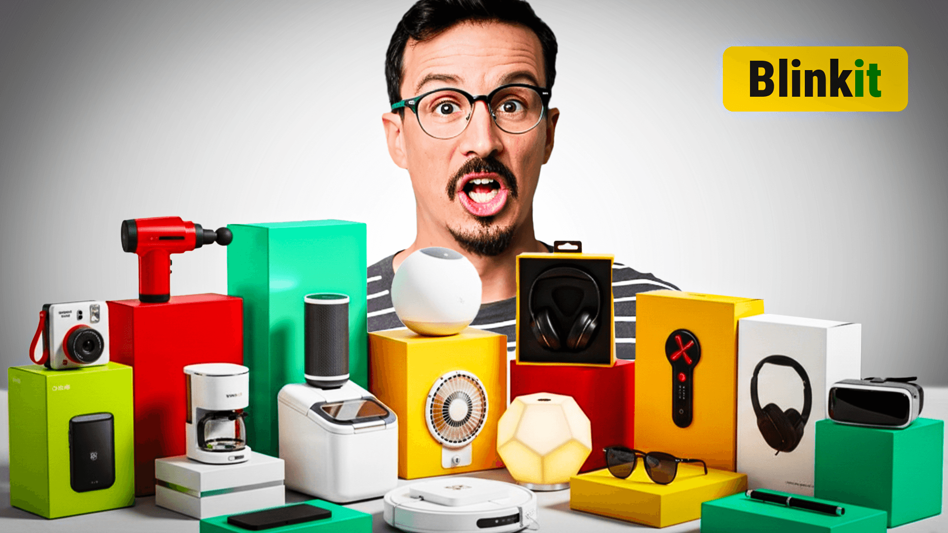
YouTube thumbnail design example — best practice 1
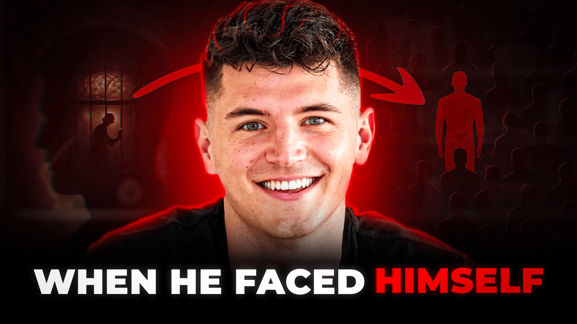
YouTube thumbnail design example — best practice 2
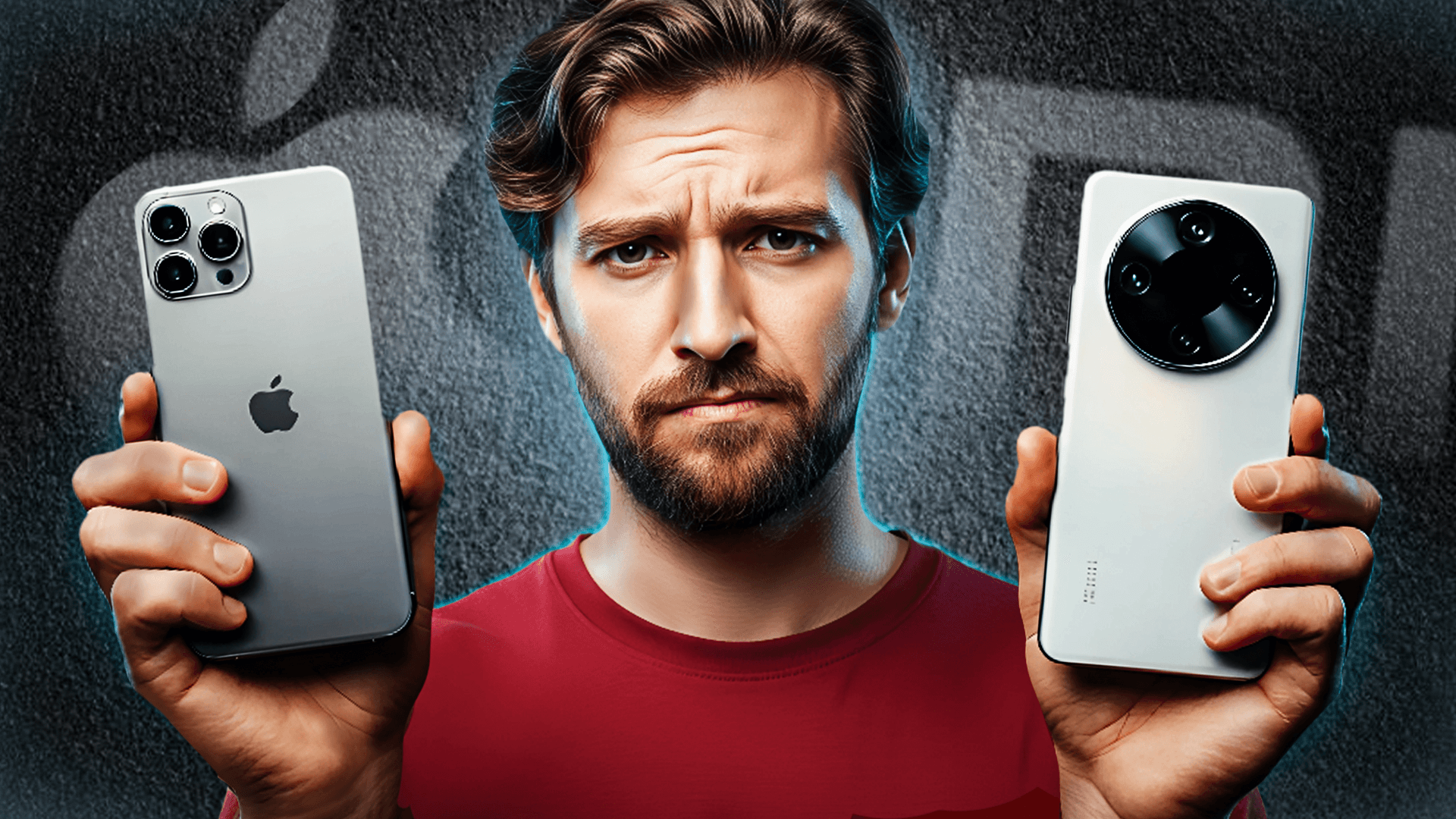
YouTube thumbnail design example — best practice 3
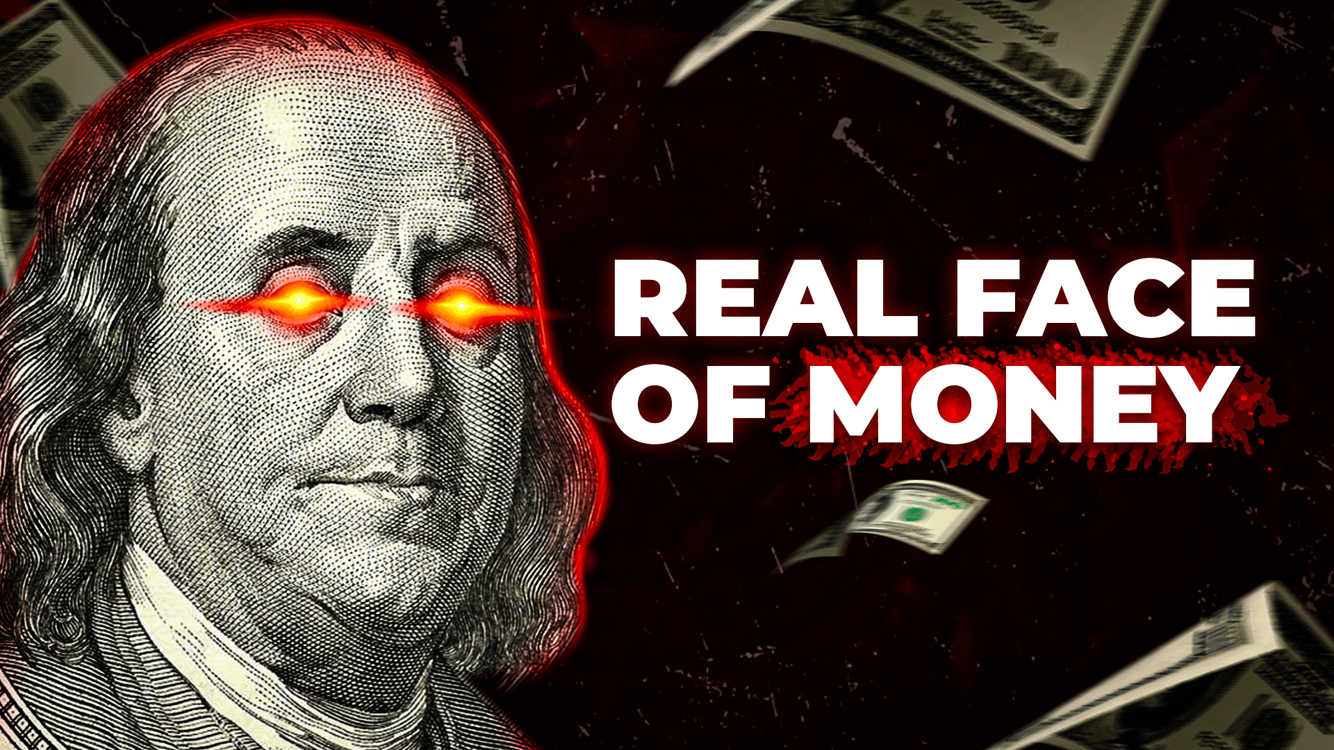
YouTube thumbnail design example — best practice 4
YouTube thumbnail design example — best practice 5
YouTube thumbnail design example — best practice 6
YouTube thumbnail design example — best practice 7
YouTube thumbnail design example — best practice 8
12 Design Best Practices
500+ Thumbnails Designed
3.6M+ Subscribers Served
Real Examples Included
Data-Backed Tips
2025 Guidelines
12 Design Best Practices
500+ Thumbnails Designed
3.6M+ Subscribers Served
Real Examples Included
Data-Backed Tips
2025 Guidelines
YouTube Thumbnail Design Guide

12 Rules for Good Thumbnail Design

These YouTube thumbnail design guidelines are based on 500+ custom thumbnails designed, tested, and optimized for real YouTube channels. Each rule includes real thumbnail design examples from our portfolio.

Best Practice 01

Use Close-Up Faces with Strong Emotion

The human brain processes faces 17,000 times faster than text. A close-up face showing surprise, excitement, fear, or curiosity instantly creates an emotional connection with the viewer. This is the single most impactful YouTube thumbnail design best practice — and the one most beginners skip.


Thumbnail design example demonstrating: Use Close-Up Faces with Strong Emotion
Pro Tip

Crop faces to fill 40-60% of the thumbnail. Eyes should be at the upper third line. Exaggerate the expression — what feels "too much" in real life looks perfect at thumbnail size.


Best Practice 02

Create High-Contrast Color Schemes

Good YouTube thumbnail design uses the warm-cool contrast principle. Warm foreground colors (orange, yellow, red) against cool backgrounds (blue, teal, deep gray) create visual tension that stops the scroll. YouTube's own interface is white and red — so blue, yellow, and green thumbnails naturally stand out in the feed.

Thumbnail design example demonstrating: Create High-Contrast Color Schemes
Pro Tip

Use complementary color pairs: orange/blue, yellow/purple, or red/teal. Add a subtle color grade to unify the palette. Avoid monochromatic thumbnails — they disappear in the browse feed.

Best Practice 03

Keep Text to 3-5 Words Maximum

YouTube thumbnail design guidelines are clear: less text = more clicks. Viewers scan thumbnails in under 2 seconds on mobile. If they can't read your text instantly, they scroll past. The best thumbnails use short, punchy phrases — a number, a question word, or a bold claim. The title carries the detail; the thumbnail sparks curiosity.

Thumbnail design example demonstrating: Keep Text to 3-5 Words Maximum
Pro Tip

Use ALL CAPS for impact. Add a thick drop shadow or dark outline so text is readable on any background. Test readability by shrinking your thumbnail to 160×90px — if you can't read it, neither can mobile viewers.

Best Practice 04

Design a Clear Visual Hierarchy

Every good YouTube thumbnail design has a clear focal point — one element that your eye goes to first. This is usually a face, then text, then supporting imagery. If the viewer's eye wanders aimlessly, the thumbnail fails. Use size contrast (make the most important element the largest), brightness contrast (brightest area = focal point), and the rule of thirds.

Thumbnail design example demonstrating: Design a Clear Visual Hierarchy
Pro Tip

Place your subject slightly off-center using the rule of thirds grid. The human eye naturally scans from left to right — place the face on the left third and the text on the right for Western audiences.

Best Practice 05

Use Custom Photo Compositing (Not Templates)

Template-based thumbnails (Canva, PicMonkey) are easy but generic. Every successful YouTube thumbnail design guide emphasizes custom compositing — combining face cutouts, background environments, props, and text layers into a unique scene. This is what separates channels with 5% CTR from channels with 10%+.

Thumbnail design example demonstrating: Use Custom Photo Compositing (Not Templates)
Pro Tip

Cut out your subject from the original video frame using Photoshop's pen tool or Select Subject. Place them on a custom background with directional lighting that matches. Add depth with drop shadows and atmospheric effects.

Best Practice 06

Make It Readable at Mobile Size

Over 70% of YouTube watch time happens on mobile. Your thumbnail is displayed as small as 160×90 pixels in the mobile feed. If your text is thin, your details are tiny, or your composition is cluttered — mobile viewers won't click. This is one of the most overlooked YouTube thumbnail design tips.

Thumbnail design example demonstrating: Make It Readable at Mobile Size
Pro Tip

Always preview your thumbnail at mobile size before publishing. Zoom out to 25% in Photoshop. If you can't identify the face and read the text at that zoom level, simplify your design.

Best Practice 07

Build Brand Consistency Across Videos

The best YouTube channels have instantly recognizable thumbnails. A consistent color palette, recurring text style, and signature composition create a brand system that viewers trust. When someone sees your thumbnail in recommendations, they should know it's YOUR channel before reading the title.

Thumbnail design example demonstrating: Build Brand Consistency Across Videos
Pro Tip

Create a thumbnail template system: pick 2-3 brand colors, a signature font, and a consistent face crop style. Apply these to every video while varying the content. Consistency ≠ sameness — it means recognizable structure with fresh content.

Best Practice 08

Thumbnail and Title Should Tell Different Stories

A common mistake in YouTube thumbnail design: repeating the title text on the thumbnail. Your thumbnail and title work as a team — the thumbnail is the emotional hook (curiosity, shock, intrigue), and the title is the rational promise (what the viewer will learn or experience). Together, they create an irresistible click package.

Thumbnail design example demonstrating: Thumbnail and Title Should Tell Different Stories
Pro Tip

If your title says "I Spent 24 Hours in a Cave" — your thumbnail shouldn't say the same thing. Instead, show a dramatic face in darkness with the text "DAY 6" to create a curiosity gap.

Best Practice 09

Use Numbers and Data Points

Numbers are pattern interrupts — they break through the visual noise of the YouTube feed. Dollar amounts ($5,000), time frames (100 DAYS), quantities, and percentages instantly communicate scale and stakes. This YouTube thumbnail design tip works across every niche: gaming, finance, vlogs, and education.

Thumbnail design example demonstrating: Use Numbers and Data Points
Pro Tip

Make numbers the largest text element. Use a contrasting color (yellow or white on dark backgrounds). Round numbers like $5,000, 100 DAYS, or 1 MILLION perform better than precise numbers like $4,873.

Best Practice 10

Create Depth with Layers and Shadows

Flat thumbnails look amateur. Good YouTube thumbnail design creates a sense of depth using multiple layers: a background, a mid-ground subject, and foreground elements like text or effects. Add drop shadows behind subjects, use subtle blur on background elements, and layer glow effects to separate elements.

Thumbnail design example demonstrating: Create Depth with Layers and Shadows
Pro Tip

In Photoshop, separate your subject from the background. Add a gaussian blur (2-4px) to the background to create depth of field. Add a colored drop shadow (not black — use a darker shade of your background color) behind the subject.

Best Practice 11

A/B Test Every Thumbnail

Even the best thumbnail designers can't predict which design will perform best. YouTube thumbnail design best practices demand testing — running 2-3 variations on every video and letting CTR data pick the winner. This single practice, applied consistently, creates a compounding improvement in channel performance.

Thumbnail design example demonstrating: A/B Test Every Thumbnail
Pro Tip

Use YouTube's built-in test feature or third-party tools like thumbnailtest.com. Run tests for at least 7 days with minimum 1,000 impressions. Track not just CTR but also the average view duration — a high-CTR thumbnail that attracts the wrong audience hurts long-term performance.

Best Practice 12

Study What Works — Then Make It Yours

The best YouTube thumbnail design guide you'll ever read is your competitors' channels. Study the top-performing videos in your niche — what thumbnail design examples do they use? What colors, expressions, text styles, and compositions drive their best CTR? Then adapt those patterns to your brand. Don't copy — analyze, extract the principle, and apply it with your unique visual identity.

Thumbnail design example demonstrating: Study What Works — Then Make It Yours
Pro Tip

Create a swipe file: screenshot the top 50 thumbnails in your niche. Sort them by view count relative to channel size. Look for patterns in face position, color schemes, text placement, and emotional tone. Use these patterns as a starting framework — then break one rule per thumbnail to stand out.

Thumbnail Design Examples

Real Thumbnail Design Examples

Every thumbnail below was designed using the 12 YouTube thumbnail design best practices above. Custom Photoshop design — not templates. Click to study the composition.

Documentary thumbnail design example following best practices — ThumbnailMate portfolio
Documentary
Finance thumbnail design example following best practices — ThumbnailMate portfolio
Finance
Gaming thumbnail design example following best practices — ThumbnailMate portfolio
Gaming
Tech thumbnail design example following best practices — ThumbnailMate portfolio
Tech
Motivational thumbnail design example following best practices — ThumbnailMate portfolio
Motivational
IRL / Vlog thumbnail design example following best practices — ThumbnailMate portfolio
IRL / Vlog
Islamic Content thumbnail design example following best practices — ThumbnailMate portfolio
Islamic Content
Documentary thumbnail design example following best practices — ThumbnailMate portfolio
Documentary
Gaming thumbnail design example following best practices — ThumbnailMate portfolio
Gaming
Tech thumbnail design example following best practices — ThumbnailMate portfolio
Tech
Finance thumbnail design example following best practices — ThumbnailMate portfolio
Finance
IRL / Vlog thumbnail design example following best practices — ThumbnailMate portfolio
IRL / Vlog
Documentary thumbnail design example following best practices — ThumbnailMate portfolio
Documentary
Gaming thumbnail design example following best practices — ThumbnailMate portfolio
Gaming
Motivational thumbnail design example following best practices — ThumbnailMate portfolio
Motivational
IRL / Vlog thumbnail design example following best practices — ThumbnailMate portfolio
IRL / Vlog
80+
Gaming Thumbnails
120+
Documentary Thumbnails
100+
Finance / Tech Thumbnails
90+
IRL / Vlogs Thumbnails
YouTube Thumbnail Design Tips

Quick Design Checklist

Run through this checklist before uploading every YouTube thumbnail. Print it, pin it, share it with your team.

  1. 1
    Face visible and showing clear emotion?
  2. 2
    Text is 3-5 words max and readable at mobile size?
  3. 3
    High contrast between foreground and background?
  4. 4
    Clear focal point — your eye knows where to look first?
  5. 5
    Custom compositing (not a Canva/template design)?
  6. 6
    Thumbnail tells a different story than the title?
  7. 7
    Brand-consistent colors, font, and style?
  8. 8
    Works at 160×90px (mobile preview size)?
  9. 9
    Includes a number, question, or bold claim?
  10. 10
    Subject layered with depth (shadows, blur, glow)?
  11. 11
    A/B test variation ready?
  12. 12
    Different from your last 5 thumbnails (no fatigue)?

Don't Have Time to Follow All 12 Rules?

Most creators don't. That's exactly why ThumbnailMate exists. We apply every single YouTube thumbnail design best practice on every thumbnail we design — so you can focus on creating content.

  • Every rule from this guide applied to every thumbnail
  • Custom Photoshop design — never templates
  • A/B testing on every video
  • Unlimited revisions included
  • Delivered in under 24 hours
  • From $13 per thumbnail
Free Trial
3 Thumbnails

No commitment. No credit card. Just send a brief on WhatsApp and see what professional thumbnail design looks like.

Get 3 Free Thumbnails

Trusted by channels with 3.6M+ subscribers

FAQ

Thumbnail Design Questions Answered

Related Pages

Chat with us! 💬